While analyzing the WPC result for my review series (starting with WPC 2018 review, part 1), I made a couple of pretty graphs, which I’d like to share here. To make these, I scraped the result PDF into a spreadsheet; I hope it’s useful to you.
To start with, a visualization of my scores per round, relative to the 10th best score. This is what I based my analysis on. A very flat Thursday, peak for the Paths round, Friday afternoon dip and then a strong finish.

My score per round relative to 10th best
Next a couple of graphs of how the positions developed over the course of the tournament. As a base-line for each of these, I chose the sum of n-th best scores per round, for a suitable n. First you can see just how much stronger Ken Endo is than anyone else, then that things were more exciting behind him than the first graph shows. And finally a top 20+ graph.
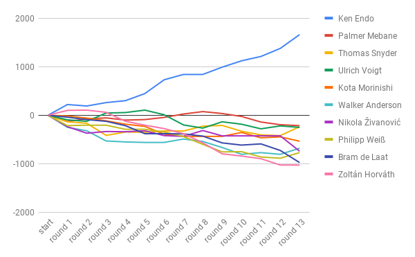
Top 10 relative to the sum of 5th best scores
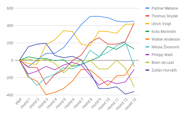
Same graph (relative to 10th best), but excluding Ken Endo

Top 20+ without Ken, relative to 15th best
I’d love to see what else you can get out of the data!
